UI Troubles Plague Civilization VII
Author: Peyton
Feb 26,2025


Civilization VII's Deluxe Edition launched recently, and online discussions are already buzzing about its user interface (UI) and other perceived flaws. But is the criticism justified? Let's delve into the game's UI elements and determine if the internet's assessment is accurate.
← Return to Sid Meier's Civilization VII main article
Early opinions on Civ VII, especially regarding its UI, are mixed. While it's easy to join the chorus of criticism, a more measured approach is needed. We'll examine the UI's components to see if it meets the criteria of a good, or at least functional, 4X interface.
While some argue for objective 4X UI design principles, the reality is more nuanced. A UI's effectiveness depends heavily on the game's context, style, and goals. However, common elements of successful 4X UIs exist, which we'll use as benchmarks.
Let's evaluate Civ VII's UI against these key elements:
A clear information hierarchy prioritizes essential gameplay information. Frequently used resources and mechanics should be readily available, while less critical features can be accessed with minimal clicks. A good UI doesn't display everything simultaneously; it organizes information logically.
Against the Storm provides a strong example. Building menus are organized into tabs, prioritizing common actions in the default tab and placing less frequent functions in subsequent tabs.
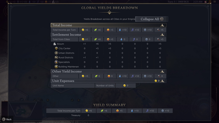
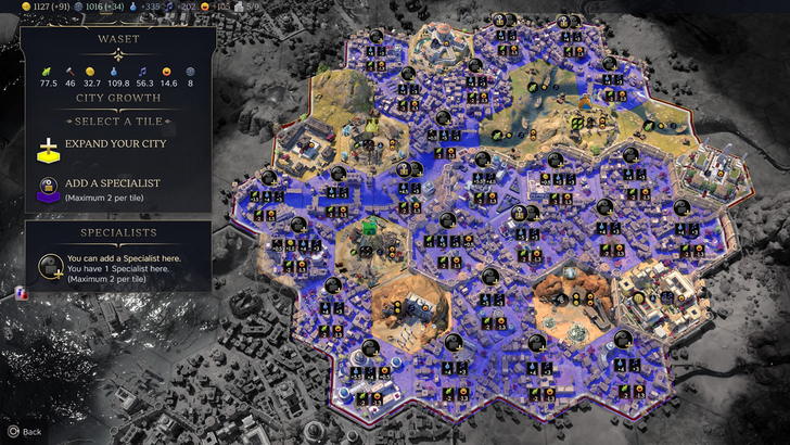
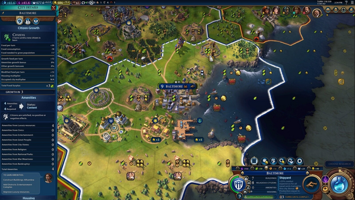
Civ VII's resource summary menu displays resource allocation, separating income, yields, and expenses. While well-structured and collapsible, it lacks granular detail. While it shows resource origins from Rural Districts, it doesn't specify the exact district or hex. Expense breakdowns are also limited. It functions adequately but could benefit from improved specificity.
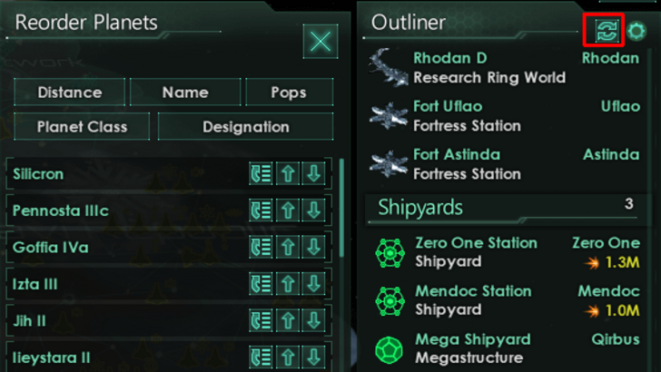
Effective visual indicators (icons, colors, overlays) convey information quickly. A well-designed UI uses visuals to communicate data efficiently, reducing reliance on text.
Stellaris, despite its cluttered UI, uses visual indicators effectively in its Outliner. Icons instantly show ship status and colony needs.
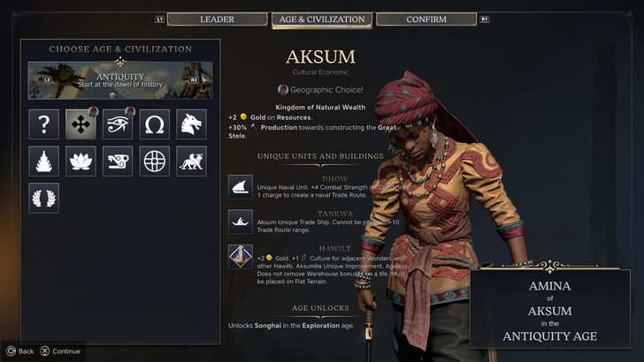
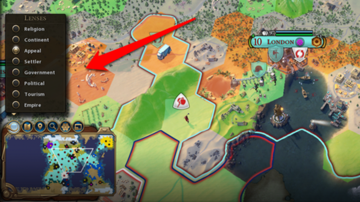
Civ VII uses iconography and numerical data. The tile yield overlay, settlement overlay, and settlement expansion screen are effective. However, the absence of certain lenses from Civ VI (appeal, tourism, loyalty) and customizable map pins are criticized. While not terrible, improvements are possible.
Search, filtering, and sorting options are crucial in complex 4X games. These features (search bars, filters, sort buttons) improve navigation and reduce frustration.
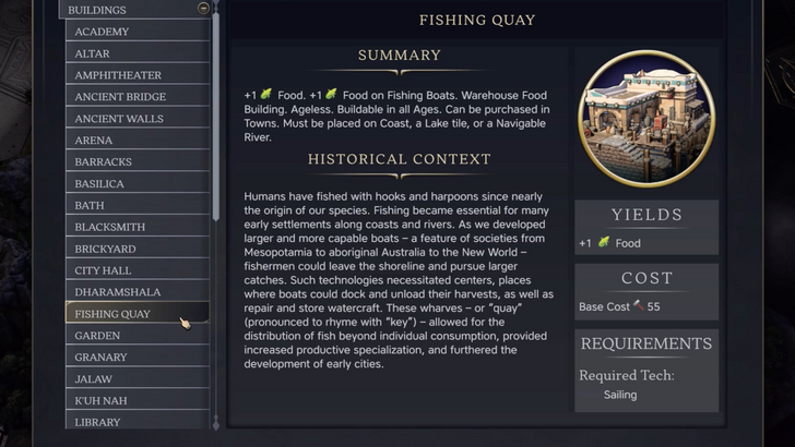
Civ VI's powerful search function allows players to locate resources, units, and features easily. Its Civilopedia links seamlessly to in-game elements.
Civ VII lacks this crucial search function, a significant usability drawback. This omission is a major point of contention. The addition of a robust search function and enhanced Civilopedia functionality are highly desirable.
The UI's aesthetic and cohesiveness are crucial. A visually unappealing UI can detract from the overall experience.
Civ VI's dynamic, cartographical style is highly praised for its thematic integration.
Civ VII adopts a minimalist, sleek design. While not cheap-looking, its subtlety leads to mixed reactions. The visual design is subjective, but the lack of immediate clarity is a concern.
Civ VII's UI, while not perfect, isn't as disastrous as some claim. The absence of a search function is a significant flaw, but not game-breaking. Compared to other issues, the UI's shortcomings are relatively minor. While it falls short of some visually striking 4X UIs, it possesses strengths. With updates and player feedback, it can improve significantly. Its current state doesn't warrant the extreme negativity it has received.
← Return to Sid Meier's Civilization VII main article